Saturday 19 December 2015
Digipak

I chose to used jarred typography in the front cover as it gives an imperfect feel to it. Unlike bands that follow a mainstream convention such as one direction, the photo on the front will be immaculate and will contain no flaws; this is because this band relies on their appearance to aid their album sales. Since I would consider my band as anti-establishment and doesn't follow mainstream trends - but - I would say I follow my genre's convention. I chose to use a different typography for the back due to the aesthetic pleasure that I liked with this font. It also follows the 80's feel I wanted to go for.
Each panel contains a different side of this ambiguous girl and then her hidden face is on the CD. I wanted to have a 360 degree view of her on the digipak because with a meaningful album, it's very personal to the artist and allows you to get to know them.
Friday 18 December 2015
Poster Ideas
For my album poster, I want it to captivate the tone of my album almost instantly. Here's some album posters that I like the look of:
 The XX's album poster, which is a similar genre to my artist, has the juxtaposition of colours which is something I want to imitate for my album poster. The artist's name is in big font which dominates the entire poster, as well with the album's name. The blue is very eye-catching in contrast to the black and white aspects of the poster which is almost exactly what I want to do with my poster - comparisons of colours. The release date, which is the main purpose of this album poster, is in the middle of the poster.
It also includes ratings from popular music magazines, NME and Q magazine, which its five star ratings boasting on either side of the poster. Featuring other links such as myspace, facebook as well as their own website will enable people to interact them more on all these different types of social media. It's also intelligently done as it promotes their platform where they can promote even more.
Here's posters that are of a different genre:


Rihanna's poster uses all dark colours but the only splash of colour is the ones promoting her singles. Whereas Kanye's is very simplistic and doesn't even contain his name; this gives it a mysterious feel as you will want to know who this is.
Digipak ideas: Inspiration from M83
The theme for our Digipak will be based around colour and the 'Girl' which, at the moment, will be Taylor.
Looking at other Digipaks, Albums and music videos, we felt heavily influenced by M83's album 'Hurry Up We're Dreaming'. As it's bold, unique and very eye-catching. The bold and dominating font instantly tells you who the band exactly is.


Looking at other Digipaks, Albums and music videos, we felt heavily influenced by M83's album 'Hurry Up We're Dreaming'. As it's bold, unique and very eye-catching. The bold and dominating font instantly tells you who the band exactly is.

The colouration of the album is what we wish to explore with our digipak, using low key lighting in the background and the two-tone lighting illuminating the Girl, as the artist SPCTRM will not be seem on the Digipak. The idea of blue and pink representing sad and love is very intriguing, especially as two people are leaning on eachother. Love is a journey of all emotions and I feel like that's fully represented in M83's album cover.
The single cover for 'Steve Mcqueen' by M83, using the technique of coloured lighting behind a close head-shot and portrays chiaroscuro. This is exactly how we want to represent the girl in the music video through the use of a Digipak. The intimacy of a close-up enables an opportunity to establish a mood by the facial expressions of the model. The girl below has a very neutral but her eyes are intriguing.

I really like the digipak of M83's, Hurry Up We're Dreaming as it's consistent black house-style juxtaposed with the bright and vivid neon colours is something i'd really want to adopt. The photography of the children is really beautiful and capture's their emotion. I love the blue and
pink portraits of the children on each CD as it represents boy / girl or connotes other binary opposites.
The lyric book is very simplistic and plain which is something I will want to take inspiration from.
Friday 11 December 2015
Production Planning: Location scouting
We're wanting to film around Soho in London as from personal knowledge, I know this type of area contains a lot of neon lights, abstract art and arcades. We're planning to go location scouting on Monday 14th December to get a proper understanding of the place we want to film.
Log -

Log -
- Date: Monday 14th December
- Time: 11am
- Where: Soho, London
- Travel:

Wednesday 9 December 2015
10 Situations That Could Ruin My Music Video
These are the ten, potential situations, that could ruin my music video.
1. Weather - The weather could be a potential danger as it's difficult to predict what the weather could turn out like. What I could do: Keep a constant eye on MetOffice's website to get a rough idea of what to expect with the weather. If it turns out to be something that I cannot work in, like a down pour, I will reschedule.
2. Camera battery - In this day and age, we aren't quite there yet with having an endless amount of lifetime with our technology. So to prevent the annoyance of a dead battery, I will bring two batteries with me to maximize my time with filming; I will also ensure both batteries will be on charge the day before shooting.
2. Camera battery - In this day and age, we aren't quite there yet with having an endless amount of lifetime with our technology. So to prevent the annoyance of a dead battery, I will bring two batteries with me to maximize my time with filming; I will also ensure both batteries will be on charge the day before shooting.
3. SD card runs out - similar to the battery situation, I will bring a spare SD card with me so I don't need to worry about running out of storage. Also before shooting, I will double check what's on the SD card and see if there's any footage that I can delete to free pace.
4. Performer cannot make it - One problem of relying on somebody to be in your music video is the danger of them not being available on the day of shooting. So to make sure I am able to get the most out of my actor's free time, I will make a Google calendar where they will be able to see days I will want them to shoot. I will also prioritise communication with my actor as if days they can't make it, I will need to reschedule.
5. Broken Equipment = Broken equipment is a risk, especially when borrowing from school, so what I will need to do is to double check if the equipment is fully working. Such as the tripod can stand up straight and all its legs can be pulled out.
6. Plan is not accessible - I understand not everything goes to plan when shooting a music video; there are situations that just aren't possible, such as filming in certain shops or arcades that I will want to do with my filming. So ahead of disappointment, I will email / phone the places I want to go to to see if they're happy with me shooing.
7. Erasing of footage - Technical faults are always a possibility and it will completely throw me off task if it happens. To avoid this happening, especially in the post-production stage, I will continuously save my work so there's no chance of it being deleted. I will also back up any footage immediately from SD card to a computer, as well as my memory stick; so I know for certain, I have at least one safe copy of all ootage.
8. Lip sync mess up - Lip syncing can be seen as a challenge for some people, luckily with a digital camera I am able to retake as many shots as my heart's content. If my performer's performance isn't up to my standards, there's no problem as we can just simply reshoot it.
9. Time management - Deadlines are always approaching when doing coursework and I will always need to meet them to ensure I get the best grade as possible. To avoid disorganisation and poor time management, I will keep a Google calendar so I know what my week looks like and what I need to complete.
10. Conflicting ideas - Working part of a team can be beneficial as work can be done more efficiently but there's a chance of ideas not matching. To avoid the conflict, I will run things through with my partner first to see if she likes the idea too (vise versa) and if not, we will work around it to see if we can edit it to compliment both of our ideas.
Wednesday 2 December 2015


Tuesday 1 December 2015
Tuesday 17 November 2015
Editing: Typography
To add to the uniqueness of my artist, I wanted to use an original font for my digipak. So instead of using default fonts on Photoshop, I decided to look online for some fonts. Websites like Dafont are excellent for situations like this as they have an abundance of unique fonts added almost every day.
The font I chose for my digipak is called "Glass Houses", I found this under the "Funky" tab of their website. I like this font as it is similar to the effect I added previously onto my digipak with the wind effect - it's disrupted.

Here's what my artist's name looks like in the typography chosen. It's really similar to fonts of the 80's which is another reason why I chose this font.

 |
| My inspiration, font from the 80s. |
 |
| colour inspiration |
When you double click the text layer, a pop-up with a variety of manipulating tools appears. When you click gradient overlay, you're able to select either default gradient settings of create a new one. I went through and really liked the blue, red yellow default preset.


Here's the final look after the gradient tool.

This is the finished product.

Editing: Wind Effect
For my digipak, I like the idea of it looking like it came straight from an old VHS television; I like that the glitches and scan lines that disrupt the image.
This is the photo after the editing process. As you can see, the rainbow hand is all disrupted and is slightly fading to the left.


 |
| This is the image before the editing started. |

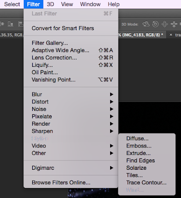
To achieve this effect, I went onto Filter > Stylise > Wind. The wind effect makes the image look like the wind is literally blowing it away.

Once I clicked my desired effect, this pop-up appeared with many different ways the wind filter can manipulate the image. I chose to stick with the wind effect as the other two were no where near the effect I wanted to achieve.

Wednesday 11 November 2015
Second Test Shoot
After doing our first test shoot, I realised the photos we obtained weren't really living up to my standards; they didn't portray the ideas that I want to reach for and plus, it's always advised to do more than one shoot.
These are some images that were successful:


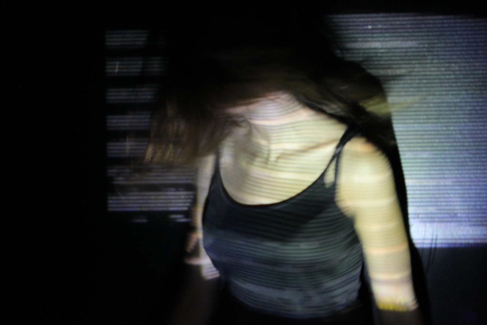
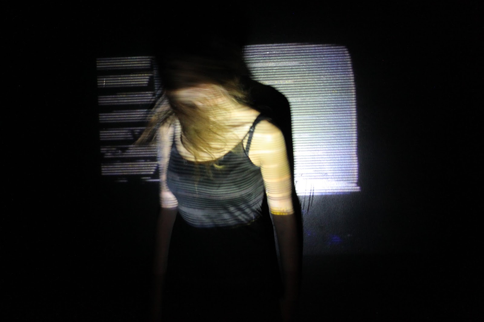
With the second photo shoot, I will be doing something completely different as new ideas have sprung into mind. However, I will be keeping some aspects of my last ideas from the previous photoshoot. I will be keeping the dark lighting and atmosphere the images will create - but using very dark, mostly completely black, to emphasise the semiotics of dark colours. The symbols being ambiguity, curiosity, isolation and also vulnerability. I believe these are all things teenagers experience, so my target demographic will be able to relate to it. Secondly, I will be using a new type of light source - using a projector to project an image onto a black wall and have somebody stand in front of it. I like this idea as it could kind of exemplify the images that are literally projected onto teenagers, images of perfection and idealisation. Again, my target demographic may be able to emphasise with this situation as teenagers are mostly the victims of living up to standards set by the likes of parents, school, friends and social media. Though, I will deliberately hide the person's face as then the body could be a vice for anybody to embody; as well, it strengthens to concept of ambiguity as you don't know who's there, what the person looks like or their emotions.
I will use some close-up shots to provide the intimacy of the character but also long-shots to also signify how we don't know the person in the photo.
With the person I will be using, ideally a girl, there are a few requirements I will want from the model:
• Mise-En-Scene - with the costuming of the model, I want it to be really depict the vulnerability of the girl and really show her youth. Perhaps an unbuttoned shirt for intimacy as previously said, an album is an exposure to a personal life - intimacy is a stage of relationship where two people combine.
•Performance - along along with the vulnerability, I want the girl to hide her face and perhaps hold herself, like she's comforting herself. As well, I will want her to shake her hair, so the images are slightly blurred - this could show an enraged mood of some sort, almost like teen angst.
Equipment needed for this shoot:
•Camera
•SD card
•Laptop
•Projector
•Tripod
•Dark room
These are some images that were successful:


Tuesday 3 November 2015
Multi-platforms
With our digipak, I want it to be completely unique and different from other albums on the shelves. I will include fun and interactive aspects that will act as a unique selling point to draw in my target audience.
Firstly for my USP (Unique Selling Point), we're wanting to include a multi platform release for our album, so: releasing it on vinyl, CD Digipak, MP3 and even cassette tape. By releasing it on multi-platforms, it allows a wide variety of people to obtain and listen to the music, so there's no excuse for people not to buy it. Also by doing this, fans who will want to collect all of our discography, they may want to buy all of these platforms which works in our benefit.
Cassette Tape -
Because we want to achieve the feel from our album that it was released in the 80's, we want to throw it back and produce a limited quantity of the album on a cassette tape. The cassette tape market is very niche now in 2015 but it will still act a USP and collector's item. From my own knowledge of things like Record Store Day or Cassette Tape Day, people go crazy for these media platforms - it's one day of the year that people appreciate these formats, as well as celebrating independent record stores.
So we want to adopt this idea. This is the mock-up image I made of our cassette tape:

This is the mock up idea of one of the vinyl:
With the vinyl pressings, which will be one of my USP, I want to have two editions to it; one being the original pressing that will always be produced and distributed and secondly, I want to have a limited edition pressing that's limited to around 500 so it acts as a USP within a USP. I have seen with many artists that they customise the vinyl themselves, the actual blackness of the vinyl is tailored to their like. Artists of similar genre like Jamie XX and M83 have previously took this route, which proves this is part of a genre characteristic:
Firstly for my USP (Unique Selling Point), we're wanting to include a multi platform release for our album, so: releasing it on vinyl, CD Digipak, MP3 and even cassette tape. By releasing it on multi-platforms, it allows a wide variety of people to obtain and listen to the music, so there's no excuse for people not to buy it. Also by doing this, fans who will want to collect all of our discography, they may want to buy all of these platforms which works in our benefit.
Cassette Tape -
Because we want to achieve the feel from our album that it was released in the 80's, we want to throw it back and produce a limited quantity of the album on a cassette tape. The cassette tape market is very niche now in 2015 but it will still act a USP and collector's item. From my own knowledge of things like Record Store Day or Cassette Tape Day, people go crazy for these media platforms - it's one day of the year that people appreciate these formats, as well as celebrating independent record stores.
 |
| News article of Cassette Store Day. |
 |
| Urban Outfitters, a major company, is starting to sell Cassettes. |
So we want to adopt this idea. This is the mock-up image I made of our cassette tape:

We still want to stick to the multicoloured house style, as cassettes are just plastic it'd be quite difficult to tailor it to how we wanted to but still keep the 80's vibe to it. So by having the transparent plastic slightly translucent with a rainbow tint, it'll still be a recognisable iconography of our style. The track-listing is still apparent on this format, almost like in a handwritten font which adds an intimate and personal feel to it. As in the 80's people used to make their girlfriends / boyfriends mixtapes, so I like this idea.
Vinyl:
Vinyl has really been brought back from the dead in 2015 as almost every artist now releases their music on this format. What I like the idea of vinyl is that it's physical in our hands, I know that CD is physical but the fact you conduct the music by placing the needle on the etched in sound waves on the slate of vinyl gives me the sense of power. I also like it when artist's album art is beautiful and having it in 12 inches is like a piece of art. Artists like Bon Iver who i've previously analysed gave me the inspiration to producing the album on vinyl due to having beautiful artwork in a bigger form.
This is the mock up idea of one of the vinyl:
 |
| Original pressing, unlimited pressings |
 |
| M83 |
 |
| Jamie XX |
Subscribe to:
Posts (Atom)